For this client’s logo, I was given free reign to come up with the design as long as it tied to her concept of Denver tier 3 performing arts. I desired a clean almost simplistic logo so I focused on choosing a font that looks like it was made for “theatre”. I found this font off of Google Fonts called “Broadway”, then I picked the title for her website Denver Metro 3 and played with the positions until it looked like this.
This client was looking for an updated logo for their company, they had inherited the current logo from the prior owner and were looking for something fresh. I provided a couple alternatives for them to choose from. I thought it would be clever to create their logo in a glass using colors that you would find in a old fashion.
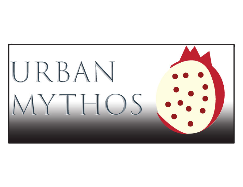
This is a logo for a fake company titled Urban Mythos, and I thought it would be a clever idea to incorporate some mythology that is recognizable, so I picked the myth about Hades and Persephone(where she eats some pomegranate seeds and is forced to be the queen of the underworld).
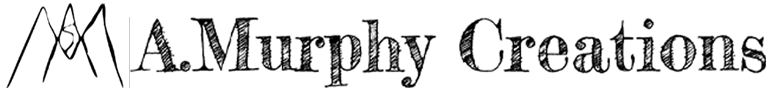
For my personal logo I played with my artist signature and finding fonts that best represented who I was and also the closest to my handwriting. I went with the one on the left but I also really enjoyed the font in the bottom logo so I incorporated this font into the titles on my pages.